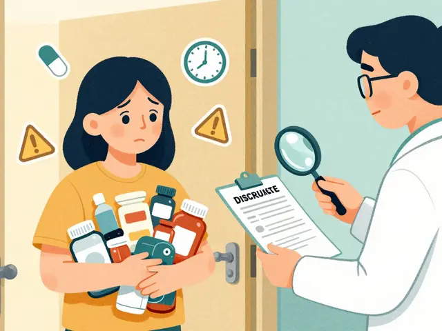
When you pick up a prescription, you might not notice the small stickers on the bottle. But those little icons - yellow, red, or blue - are there to keep you safe. They’re not decorations. They’re warnings. And if you don’t understand them, you could be putting your health at risk.
What Do Those Symbols Actually Mean?
Pharmacy warning icons are visual cues designed to tell you something critical about your medicine. They’re meant to work even if you can’t read well, don’t speak English, or are in a hurry. A red circle with a slash through a glass means do not drink alcohol. A yellow triangle with a sleeping person means this medicine can make you drowsy. A blue square with a hand and a dropper means use only on the skin. These aren’t random. They’re based on standards developed by the Institute for Safe Medication Practices (ISMP) and supported by the FDA. Since the mid-2000s, most U.S. pharmacies have used color-coded labels to flag risks like drowsiness, interactions, or dangers for certain groups like pregnant women or seniors. But here’s the problem: many people don’t know what they mean. A 2019 study found that 42% of patients think red means "danger," yellow means "caution," and blue or green means "just a suggestion." That’s not how it works. A yellow label might mean "take with food" - not a life-or-death warning, but still important. A red label could mean "avoid sunlight" - a serious risk if you’re on antibiotics like doxycycline.Why Do Some Labels Confuse People?
The biggest issue isn’t the symbols themselves - it’s the inconsistency. In New Zealand, every pharmacy uses the same 10 warning labels. In the U.K., there are only nine standardized icons. But in the U.S.? It’s a mess. CVS uses 14 different labels. Walgreens uses 17. Independent pharmacies often have 20 or more. That means if you fill a prescription at two different stores, the same drug might come with different warnings - or none at all. Even worse, some symbols are just plain misleading. The "external use only" icon - a hand with a dropper - is meant to say "don’t swallow this." But in a 2019 study, 90.7% of patients thought it meant "apply to your hand," not "don’t take by mouth." One Reddit user shared that their mother took eye drops orally because she misread the dropper icon as a sign to drink it. Another common mistake: "Do not chew or crush." Many patients think that means "don’t swallow it whole." In reality, it means "swallow it whole - don’t break it open." That misunderstanding led to 57.3% of patients in one study taking pills the wrong way - which can be deadly with time-release medications.Who Decides What Goes on the Label?
Pharmacists pick the warnings based on the drug’s risks and the patient’s profile. But they’re not mind readers. They don’t know if you’re a truck driver, a grandparent with poor eyesight, or someone who drinks two glasses of wine every night. That’s why the FDA and ISMP pushed for standardization. In 2022, the FDA released draft guidelines proposing just 12 core warning icons nationwide. CVS and Walgreens have already started cutting their systems down to match. By 2026, the goal is for every pharmacy in the U.S. to use the same set of symbols. But even with better icons, the system still has flaws. A 2020 study found that 41.2% of patients said they understood their labels - but when tested, they got the meaning wrong. It’s not just about seeing the symbol. It’s about knowing what it means.What’s Being Done to Fix This?
Some pharmacies are trying new tricks. Kaiser Permanente tested augmented reality labels. When you point your phone at the bottle, a short video plays showing how to take the medicine. In their pilot, patient understanding jumped from 58% to 89%. Other pharmacies are adding QR codes that link to audio instructions in multiple languages. That helps non-English speakers - but not if you’re over 65 and don’t use smartphones. Pew Research found that 24% of seniors don’t regularly use smartphones. So tech fixes can’t be the only solution. The best fix? Talking to your pharmacist. A 2022 study showed that when pharmacists explain the warning icons out loud - not just stick them on the bottle - patient comprehension improves by 63%.What You Can Do Right Now
You don’t have to wait for the system to get better. Here’s what to do every time you get a new prescription:- Ask: "What does this symbol mean?" Don’t assume. Even if you’ve seen it before, the meaning might be different for this drug.
- Ask: "Is this warning for everyone, or just me?" Some labels are general. Others are tailored to your age, other meds, or health conditions.
- Ask: "What happens if I ignore this?" "Drowsiness" might mean "don’t drive." Or it might mean "you’ll feel tired all day." Know the risk.
- Take a photo of the label. If you forget what it says, you can check later.
- Use the CDC’s "Every Dose Counts" tool. It’s free, online, and explains common warning icons in plain language.
Why This Matters More Than You Think
Medication errors kill at least 7,000 people in the U.S. every year. Many of those deaths come from simple misunderstandings - taking a drug with alcohol, missing a dose because you thought "take with food" meant "only eat when you take it," or crushing a pill that should be swallowed whole. These icons are meant to prevent that. But they only work if you understand them. The system isn’t perfect. It’s messy, inconsistent, and sometimes misleading. But it’s also the best tool we have to stop preventable harm. Your job isn’t to fix the system. It’s to use it right.Common Warning Icons and What They Really Mean
| Icon Description | What It Means | What People Often Think It Means |
|---|---|---|
| Yellow triangle with sleeping person | This medicine can cause drowsiness. Avoid driving or operating machinery. | "I’ll just take it at night." (But it can still affect you the next day.) |
| Red circle with a glass and slash | Do not drink alcohol. Can cause dangerous reactions. | "I can have one glass of wine." (Even small amounts can be risky.) |
| Blue square with hand and dropper | For external use only. Do not swallow. | "Apply to my hand." (Means: don’t take by mouth - even if it looks like a drink.) |
| White rectangle with "Take on empty stomach" | Take at least 1 hour before or 2 hours after eating. | "I’ll take it with a cracker." (Food can block absorption.) |
| Black triangle with "Do not crush" | Swallow whole. Crushing can release too much medicine at once. | "I can’t swallow pills. I’ll crush it." (Can be fatal with extended-release drugs.) |
Frequently Asked Questions
Why do some pharmacies have more warning labels than others?
There’s no national standard yet. CVS, Walgreens, and independent pharmacies each use their own systems. Some add extra warnings "just to be safe," which can overwhelm patients. By 2026, the FDA plans to enforce a single set of 12 standardized icons across all U.S. pharmacies to fix this.
Can I ignore a warning if I’ve taken the medicine before without problems?
No. Warnings are based on how the drug works in your body - not your past experience. A drug might be safe with one set of other meds, but dangerous with another. Your health, age, liver function, or other conditions can change. Always check with your pharmacist before skipping a warning.
What if I can’t read the small print on the label?
Ask the pharmacist for a larger print version. Most pharmacies can print a simplified label with bigger text. You can also request an audio version or a video explanation. The CDC’s "Every Dose Counts" campaign offers free downloadable guides with large fonts and clear icons.
Are warning icons the same for over-the-counter drugs?
No. OTC drugs follow FDA labeling rules, but they don’t use the same pharmacy warning icons. Their labels have text warnings like "May cause drowsiness" or "Do not use if you have high blood pressure." Always read the Drug Facts box - it’s the law. Pharmacy icons are only for prescriptions.
What should I do if I think a warning label is wrong?
Don’t guess. Call your pharmacist or doctor. If you’re unsure whether a warning applies to you, it’s better to ask than to assume. You can also report confusing or incorrect labels to the FDA’s MedWatch program - your feedback helps improve the system.


Corra Hathaway
November 20, 2025 AT 15:42Clifford Temple
November 22, 2025 AT 08:55Simone Wood
November 23, 2025 AT 00:05Paula Jane Butterfield
November 24, 2025 AT 09:45Sheldon Bazinga
November 25, 2025 AT 11:25Sandi Moon
November 26, 2025 AT 18:27Kartik Singhal
November 27, 2025 AT 09:54Chris Vere
November 27, 2025 AT 17:14Pravin Manani
November 29, 2025 AT 17:00Mark Kahn
December 1, 2025 AT 00:20Leo Tamisch
December 2, 2025 AT 10:29